
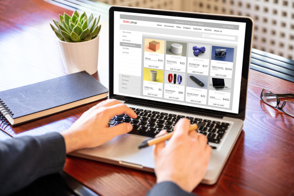
The product page is the centerpiece of every ecommerce purchase decision, and most stores get it wrong. Baymard Institute’s 2026 research finds 62 percent of leading ecommerce sites have “mediocre” or worse product page UX. Only 48 percent of US and European desktop ecommerce sites achieve a “decent” or “good” product page rating, and zero sites achieve “perfect” performance. UI design choices alone — image gallery quality, CTA placement, variant selectors, trust signals, micro-interactions — separate stores converting at 6 percent from stores converting at 2 percent on identical traffic.
The 2026 reality is structural. Customers don’t tolerate friction. They expect speed, clarity, and confidence at every step. User-generated photos outperform studio shots by 2.4x on apparel and home goods product pages. AI-powered semantic search converts at 8.4 percent versus 1.8 percent for keyword search. A 1-second delay in page load reduces conversions by 7 percent. Product page UI in 2026 isn’t an aesthetic exercise — it’s a measurable revenue lever where every interface decision either reduces friction or adds it.
This guide walks through product page UI for ecommerce in 2026 — the above-the-fold architecture, image gallery patterns, sticky CTAs and variant selectors, micro-interactions, mobile thumb-zone design, trust signal placement, information architecture, modular adaptive layouts, the UI patterns that damage conversion, and the measurement framework that proves UI design drives revenue. Written for ecommerce store owners who want their highest-stakes single page interface working as hard as the data demands.
Why does product page UI matter so much in 2026?
Three structural shifts have made product page UI design more decisive than ever:
- Customer attention compression — visitors decide whether to engage within 5 to 8 seconds; UI clarity determines whether they stay
- Mobile dominance — 60-75 percent of ecommerce traffic on mobile where UI mistakes amplify across smaller screens
- AI mediation — AI Overviews and recipient AI increasingly mediate product discovery; UI clarity determines what gets surfaced
What this means in practice: UI mistakes that were tolerable in 2020 actively suppress conversion in 2026; mobile UI quality determines whether 60-75 percent of your traffic converts at parity with desktop; rich, structured product UI helps AI Overviews surface your products; customer expectations rise as best-in-class brands set new standards.
The compounding economics: product page UI improvements compound across every product, every visitor, every paid acquisition dollar. A clean product page UI redesign typically lifts conversion 20-40 percent within 60-90 days.
This connects to broader conversion rate optimization — product page UI is one of the highest-ROI conversion levers because it determines whether qualified traffic actually buys.
What needs to be above the fold on a product page?
The above-the-fold area does most of the heavy lifting. Visitors form their initial buy/skip decision based on what loads in the first viewport. The five elements that consistently belong above the fold:
1 — Primary product image with gallery navigation
- Large, high-resolution hero image that loads fast
- Multiple-angle gallery accessible without scrolling
- Zoom functionality for detail inspection
- At least one “in scale” image (Baymard finds 28% of sites get this wrong)
- Mobile-optimized crop that doesn’t cut critical detail
2 — Product title and price
- Clear product name in legible heading style
- Price prominently displayed with currency
- Sale price with strikethrough original (when applicable)
- “Price per unit” for multiquantity items (Baymard: 86% of sites don’t display this)
3 — Variant selectors
- Size, color, configuration options visible without scrolling
- Visual swatches for color (not text dropdowns)
- Out-of-stock variants visible but disabled, not hidden
- Size guides accessible via clear link
4 — Add to cart CTA
- Single primary CTA with maximum visual prominence
- Sticky implementation that stays visible during scroll
- First-person framing where space allows (“Add to my cart” lifts clicks up to 90%)
- Clear loading and success states
5 — Quick trust signals
- Star rating with review count
- Stock availability or shipping promise
- Guarantee or return policy snippet
What doesn’t belong above the fold: long product descriptions before customers can see images, newsletter popups blocking the product, multiple competing CTAs, generic stock photography hero, aggressive scarcity countdowns.
This connects to broader product page optimization — the above-the-fold UI architecture is the foundation that every other product page improvement compounds on.
How should you design the product image gallery?
Product images do more conversion work than any other UI element. Customers can’t touch products before buying; the image gallery is the closest substitute. The patterns that consistently work:
- Large primary image with smaller thumbnails or scrollable gallery navigation
- Multiple angles — front, back, side, detail shots
- Lifestyle shots showing product in real-world context
- Scale reference showing size relative to known objects or human models
- Zoom on hover (desktop) or pinch-to-zoom (mobile)
- 360-degree views for products where rotation matters
- Video integration showing product in motion or use
- UGC integration — customer photos outperform studio by 2.4x
Baymard research findings worth specific attention: 28 percent of leading sites lack at least one in-scale image; apparel, accessories, and cosmetics need human-model imagery; reviewer-submitted images should be navigable through the review section.
What kills image gallery performance: single image with no alternative angles, studio-only photography for products customers need to visualize in context, heavy file sizes that slow page load, carousel auto-rotation that distracts users, hidden images requiring multiple clicks to find.
For categories where customers can’t physically experience products (bedding, fragrance, food), pair images with sensory descriptions. Brooklinen describes sheets as “cool, crisp, and breathable” — two sentences that do more conversion work than thread counts.
How does sticky CTA design affect conversion?
The sticky add-to-cart pattern is one of the highest-impact 2026 UI patterns. It keeps the primary action visible as customers scroll through product details, reviews, and recommendations.
The implementation principles:
- Mobile sticky bottom bar — add-to-cart accessible at all times, thumb-zone positioned
- Desktop sticky sidebar — variant selector and CTA stay visible during long-scroll content
- Smart appearance — sticky element appears only after user scrolls past the original CTA
- Visual prominence — sticky version maintains brand consistency without fighting other elements
- Variant context — selected size/color reflected in sticky bar for confirmation
Why it works: removes the friction of scrolling back up to convert, maintains decision momentum throughout content consumption, provides constant reminder of the primary action, reduces cart abandonment from “lost the buy button.”
Implementation mistakes: sticky CTAs that block essential content on mobile, multiple competing sticky elements (chat widget + sticky CTA + scarcity bar), sticky elements with poor color contrast, sticky variants that don’t update when selection changes, animations that feel jittery on scroll.
For deeper coverage of mobile-specific patterns, see our mobile-first design and mobile conversion optimization posts.
How do micro-interactions improve product page UX?
Micro-interactions — small animated feedback moments — quietly drive conversion lift across product pages. The micro-interactions that consistently work:
- Button hover states — color shift, slight elevation, cursor change signaling clickability
- Selection confirmations — subtle animation when variant selected
- Add-to-cart feedback — brief confirmation animation acknowledging the action
- Image zoom transitions — smooth scaling rather than jarring jumps
- Wishlist heart animations — playful feedback when items saved
- Loading state indicators — progress bars or skeleton screens during data fetch
- Quantity selector tactility — increment/decrement buttons with clear feedback
Why micro-interactions matter: provide immediate confirmation that user actions registered, add personality that distinguishes brand experience, reduce uncertainty about whether interactions worked, make interfaces feel responsive and alive.
What kills effectiveness: excessive animation that delays interaction, heavy effects that lag on mobile, inconsistent animation patterns across the site, animations that block actual interaction completion, distracting motion that pulls attention from primary tasks.
Best-in-class brands use micro-interactions sparingly. The pattern is barely noticeable when working well — interface feels responsive without animation calling attention to itself.
How does mobile product page UI differ from desktop?
Mobile produces 60-75 percent of ecommerce traffic with consistently lower conversion than desktop. Closing that gap requires UI choices specifically optimized for mobile context.
The mobile UI patterns that work:
- Thumb-zone navigation — primary actions reachable without thumb strain
- Single-column layout — desktop multi-column compresses badly to mobile
- Sticky add-to-cart at bottom — accessible during all scroll states
- Larger touch targets — minimum 44×44 pixels per Apple Human Interface Guidelines
- Swipeable image galleries — horizontal swipe rather than dot navigation
- Collapsible sections — accordion patterns for product details, specs, reviews
- Mobile-specific imagery — vertical crops that work on portrait orientation
What kills mobile product page conversion: hover-dependent interactions that don’t work on touch, pop-ups that block content immediately on landing, tiny tap targets requiring precision impossible on mobile, multi-column variant selectors compressed to unreadable widths, image galleries requiring multiple taps to access alternatives.
The 2026 reality: mobile-first is no longer a competitive advantage — it’s the minimum expectation. What separates high-performing brands is the quality of mobile UI optimization, not just responsiveness. Products designed for mobile typically outperform products adapted to mobile.
Where should you place trust signals visually?
Trust signals do double duty on product pages — they reassure cautious buyers and reinforce credibility for returning customers. The visual placement framework:
- Above the fold (compact) — star rating, review count, key trust badge
- Mid-page (substantial) — customer photos, detailed reviews, expert mentions
- Near the CTA (decision moment) — guarantee, return policy snippet, security badge
- Footer (comprehensive) — full reviews section, certifications, policies
What works visually: star ratings using simple visual icons, review count numbers signaling volume (“Based on 4,247 reviews”), customer photo galleries integrated into the product image area, trust badges sized appropriately (visible but not dominant), security indicators near payment/checkout-leading actions.
What undermines trust visually: stock photography that appears on competing stores, generic 5-star testimonials without verification, fake “X people viewing this” counters, aggressive countdown timers manufactured for urgency, cluttered trust badge sections that feel desperate.
The 2026 pattern that’s working: integrated transparency. Ritual’s product pages display ingredient sourcing, research backing, and supply chain detail directly in the page UI rather than buried in a footer tab. This makes a health-conscious buyer feel they’ve done due diligence in 90 seconds.
How should you structure information architecture below the fold?
Long product pages need structured information architecture so customers can find what matters to them without scrolling through irrelevant content.
The patterns that work:
- Tabbed sections for distinct content categories (Description, Specifications, Reviews, Q&A)
- Accordion sections for mobile-friendly collapsible content
- Inline expansion for “Read more” patterns within content blocks
- Anchor links in description for jumping to specific sections
- Sticky table of contents for very long product pages
What information typically lives below the fold: detailed product description with use cases, technical specifications and dimensions, materials and care instructions, customer reviews with photos, frequently asked questions, related and recommended products, brand story or origin context.
The 2026 evolution: modular, intent-adaptive layouts where the UI prioritizes visuals, benefits, or specifications based on how users interact. A first-time visitor sees the brand story; a returning visitor sees specifications first. This requires data infrastructure most stores don’t have, but the conversion lift is significant.
For deeper coverage of design strategy broadly, see our UI trends and UX design principles posts.
What UI patterns consistently damage conversion?
The patterns that suppress product page performance across most ecommerce stores:
- Auto-playing video with sound — interrupts product evaluation
- Aggressive popups blocking the product — Google penalizes; users abandon
- Fake scarcity countdowns — erodes trust when users see them everywhere
- Carousel hero with auto-rotation — banner blindness, slow rotation, decision fatigue
- Hidden essential information — return policy, shipping, sizing buried 3+ clicks deep
- Multiple competing CTAs — Add to Cart, Buy Now, Subscribe, Wishlist all visible at once
- Unclear out-of-stock states — variants that look available but aren’t
- Slow image loading — every second of delay costs 7% conversion
- Mobile-unfriendly variant selectors — text dropdowns instead of visual swatches
- No size or scale references — Baymard finds 28% of leading sites lack at least one in-scale image
A clean product page UI audit usually surfaces 4-6 of these. Fixing them typically lifts conversion 20-40 percent within 60-90 days.
How should you measure product page UI performance?
Most ecommerce teams measure product pages by aggregate conversion rate. The metrics that surface UI-specific opportunities:
- Add to cart rate — primary indicator of UI effectiveness
- Scroll depth — what percentage of visitors reach below the fold
- Time on product page — engagement depth signal
- Image gallery interaction rate — clicks, swipes, zooms
- Variant selection completion rate — flags variant UI friction
- Mobile vs desktop conversion gap — quantifies mobile UI opportunity
- Heat maps and session recordings — qualitative behavioral data
- Sticky CTA engagement — clicks from sticky vs main CTA position
Tie performance back to broader conversion rate goals and increasing AOV frameworks.
The gold standard is A/B testing UI changes systematically — testing CTA placement, image gallery patterns, variant selector styles, and trust signal positioning to isolate which UI choices drive measurable conversion lift. Most stores find 4-6 UI improvements compound to 30-50 percent total conversion lift within 6 months.## What stage of brand benefits most from UI investment?
Three tiers cover most ecommerce brands.
Starter stage (under $50K monthly revenue)
- Theme-based product pages with platform-native UI
- Basic image gallery with multiple angles
- Standard variant selector and add-to-cart
Total cost: typically $0-$300 one-time. Goal: clean, fast product pages that don’t actively damage conversion.
Growth stage ($50K to $500K monthly)
- Custom theme or template with brand-specific UI
- Sticky CTA implementation
- Enhanced image gallery with zoom and video
- A/B testing infrastructure
- Mobile-specific UI optimization
Total cost: typically $2,000-$10,000 development plus ongoing optimization. Goal: product pages drive 30-50 percent conversion lift over default themes.
Scale stage ($500K+ monthly)
- Custom-built product page UI with adaptive layouts
- AI-driven personalization across product surfaces
- Sophisticated image and video systems
- Continuous UI testing and optimization
- Mobile-first design with native app-quality interactions
Total cost: typically $25,000+ development plus dedicated optimization team. Goal: product pages become competitive advantage; conversion rates 5-8 percent versus industry average 2-3 percent.
When should you bring in help with product page UI?
Product page UI is learnable. Plenty of ecommerce founders ship effective product pages and iterate well. But coordinating image strategy, variant UX, sticky CTAs, micro-interactions, mobile optimization, and continuous A/B testing is more than a side project at scale.
Hire help when:
- Your monthly revenue exceeds $50,000 and product page conversion has plateaued
- Mobile conversion lags desktop by more than 30 percent
- Your product page UI hasn’t been refreshed in 18+ months
- You want to integrate UI improvements with paid scaling strategy
- You need someone managing systematic A/B testing across product page UI
A strong ecommerce growth partner treats product page UI as a continuous optimization surface across performance, mobile experience, trust signals, and personalization — auditing by impact, prioritizing fixes that move money, and tying UI changes to total business performance.
Frequently asked questions about product page UI
What’s the most important UI element on a product page?
The product image gallery, hands down. Customers can’t touch products before buying; the image gallery is the closest substitute. Quality images with multiple angles, zoom, lifestyle context, and scale references drive more conversion than any other UI element. Baymard finds 28 percent of leading sites lack at least one in-scale image — fixing this single issue often lifts conversion measurably.
Should I use a sticky add-to-cart button?
Yes for most ecommerce categories. Sticky CTAs lift conversion by keeping the primary action visible during scroll. Implementation matters — appear after the user scrolls past the original CTA, maintain brand consistency, ensure mobile thumb-zone placement, and reflect variant selection clearly. Most stores see 5-15 percent conversion lift from well-implemented sticky CTAs.
How many product images should I include?
Minimum 4 images: front, back, side, and lifestyle/scale reference. Most categories benefit from 6-10 images including detail shots, variants in different colors, and customer photos. Apparel, beauty, and home goods especially benefit from human-model imagery. The trade-off is page load speed — compress aggressively and use lazy loading for below-the-fold images.
Should I add product video?
Yes when feasible. Video typically lifts conversion 60-87 percent across categories. Demonstrate product in use, show scale and dimension, highlight features photos can’t capture. Avoid auto-play with sound and keep videos under 60 seconds. UGC video often outperforms produced video.
What’s the biggest mobile product page mistake?
Hover-dependent interactions and tap targets too small for thumb interaction. Mobile design requires thumb-zone navigation, larger touch targets (44×44 pixel minimum), and tap-friendly variant selectors. Brands designing desktop-first then “responsive-ifying” for mobile typically have mobile conversion 30-50 percent below desktop.
How often should I redesign my product page UI?
Major redesign every 2-3 years; continuous optimization between. Patterns shift over 24-36 month cycles as customer expectations evolve. Continuous A/B testing of CTA placement, image gallery, variant selectors, and trust signals captures incremental gains between major redesigns. Stores untouched in 3+ years typically have 5-8 fixable issues compounding silently.
Scale your product page UI with CV3
CV3 brings your platform, design strategy, and broader growth system under one roof so product page UI works as part of your business rather than a one-time setup. Our Platform plus Agency model gives you:
- A flexible storefront purpose-built for modern product page UI with native sticky CTAs, fast image rendering, and clean schema markup
- A growth team that audits product page UI by revenue impact, prioritizes fixes that move money, and runs continuous A/B testing
- An ecommerce search engine optimization agency and PPC management team using product page data to inform paid and organic strategy
- An email marketing services team that converts product page visitors into recurring customers
If you want a partner who treats product page UI as a continuous revenue lever, talk to CV3 about scaling your store.